Stress and Performance Report Visualizing Tool
The Report Visualizer is a supplemental tool for Enterprise edition of the DTM DB Stress. It offers more than 20 visual presentations for reports components. The software supports three report types: basic execution report (.strrep), SQL statement report (.sql) and execution comparison report (a set of .strrep files).
The following table describes most popular diagrams:

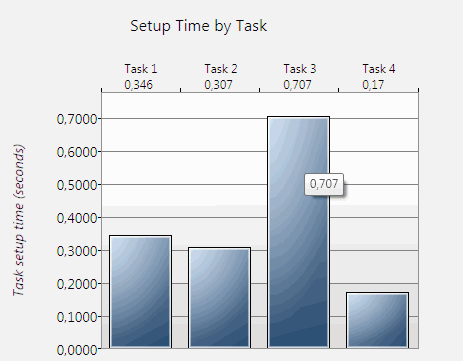
The "Task Setup Time" visualizer shows time required for task initialization. It shows individual value for each active (enabled) task of the executed project. This view is suitable when you need to analyze total initialization time of all threads of the task.
The program shows initialization time for each task under task number above the diagram. Also, each column has tooltip with value in seconds.
The vertical datum line corresponds to time from 0 seconds when horizontal has list of present tasks.
This view is applicable to basic execution report (.strrep). Also, you can get same view for results of the execution report comparison.
The example at the right side of the page shows project with four active tasks. The fastest task is "Task 4"; it tales 0.17 seconds to initialize only. The slowest one is "Task 3", initialization time is 0.707 seconds in this case.

The "Time Distribution" pie diagram compares time of each execution stage of the thread. It deals with four steps:
- Database connection establishment
- SQL statement execution
- Data fetching to client (reading data rows)
- Disconnection
Each part of the diagram has tooltip with value (seconds) and percent of all thread time execution.
For example, data fetching stage takes 3.944 seconds or 89.47% at the sample view shown at the right side of the page.
The report visualizer allows the user to select task and thread to be visualized with this view.
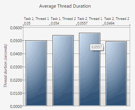
The "Average Thread Duration" view shows average time of execution for each thread of each task. However the user can select single task to visualized. In this case only threads of the selected task will be shown.
The vertical datum line corresponds to time from 0 seconds when horizontal has list of present threads grouped by tasks. Each diagram column has tooltip with value in seconds.

At the right side of the page you can view example:
- Project has two tasks ("Task 1" and "Task 2")
- Both tasks have two threads ("Thread 1" and "Thread 2")
- The first thread of the second task is slowest and requires 0,0557 seconds to execute
This view is applicable to basic and comparison reports.

The report comparison feature allows the user to analyze a few execution reports at once. It can help to analyze results of performance tuning operations if execute the same job before and after optimization.
This view compares speed for selected threads of the selected task. The "thread speed" is number of thread executions (iterations) per second.
The vertical datum line corresponds to number of executions from 0 when horizontal has list of present reports. Each diagram column has tooltip with speed value. The program shows speed rate for each thread of the comparison report under report/task number above the diagram.
The example at the right side created for two reports ("Report 1" and "Report2") and compares velocity for the first thread of the "Task 1". In this context "Task 1" is the first task of the project, actual task name does not matter.

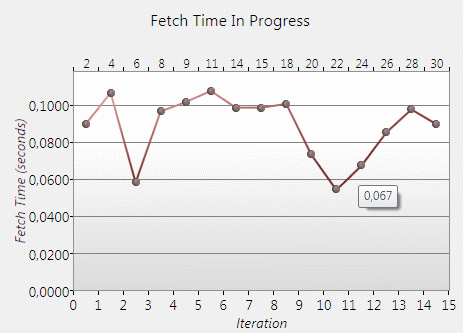
This "Fetch Time Progress Diagram" deals with .sql reports only. It is suitable if the user want to view data fetching time in progress. It can show speed degradation or increasing as well as influence of known external events.
The program shows fetch time for selected thread from the first to the last iteration.
The vertical datum line corresponds to fetching time from 0 seconds when horizontal has list of present iterations. Also each point has tooltip with iteration fetching time in seconds.
The user should select task and thread to be visualized. Otherwise the program uses the first thread of the first task.
The report visualizer is Windows .Net application that compatible with Windows XP, Vista or 7, Windows 8/10 (desktop) or Windows Server family with Microsoft .net 3.5 SP1 or newer.